Showing posts with label sculpting. Show all posts

Sunday, 31 July 2011

Face To Face With The Joker Part 4: Hearts


So this final Joker blog is simply something with a little bit of light hearted flavour to share with you.

As I have said in a previous blog there has been a little bit of fun along the way with his development.

Jokers Recipe:

Uno-Dent- Alignate and stone powder.
Claydium- Nylon enforced clay.
Claydium- Terracotta.
Milliput white- Two Part Epoxy.
Tamiya- Surface Primer in Grey.
Tamiya- Olive Drab.
Tamiya-Racing Green.
Tamiya- Purple.
Tamiya- Semi-Gloss Black.
Citadel- Snot Green.
Citadel- Goblin Green.
Citadel- Skull White.
Citadel- Scab Red.
Citadel- Red Gore.
Citadel- Blood Red.
Windsor & Newton- White Acrylic.
Windsor & Newton- Sap Green.
Windsor & Newton- Ultra-Marine.
Revell- High Gloss.

So those of you who know me well, know that I have a fairly easy going policy on popping round, staying over etc.. my fridge is your fridge kinda attitude and if you fancy a drink just go and get one!!!

Joker fitted into family life very well.


Joker has a rather impressive self grooming regime... showered at least twice a day, a hair was never outta place eyes were glistening and manic smile ready to greet is awaiting public of four five year olds bearing batarangs, handcuffs, water pistols and brooms... He took it all in good part.


My oh my... they grow up so fast... Soon Joker wanted a place and a special someone to call his own.


He was known to entertain the local birds and he made a mean mojito!!... which any fancy female would find it hard to resist and soon found a soul mate in one of our long standing lodgers Vultch... the cuddly vulture.


Love was in the air.....


It's a rather sensitive subject and it's been very polite of you to have not pointed out... Joker has a lack of TORSO and limbs.


He never let this get in his way and soon found his favoured means of transport around the place looking like a reject from a Terry Gilliam excerpt buzzing around on his battery powered digger.


The nest was soon complete... but soon laughter was heard and all did not seem quite so right with his joy buzzard...

The final words heard were; This One'll Kill You...


Tha-ha-ha-ha-ha-hat's All Folks!


Sunday, 24 July 2011

Face To Face With The Joker Part Three: Clubs!


So here we are on part three which will be the final blog on composition.

Using a coarse nail file and craft knife I took to making his cheeks thinner and slightly more prominent.

Stripped the original clay which formed the coat and used sheet plastic to form the shirt collar.

Using Terracotta a new jacket was formed as well as extending the Jokers chin and make the crows feet lines around his eyes and mouth deeper.


I chose to use terracotta for the coat as it needed to be a different clay with a heavier texture than what was used mainly for his hair and only added a few strands with the terracotta.


Using glass paper to thin down the sides of the face but leaving them slightly uneven along with the lapels on his coat.

Following the words of the great Tim Bruckner who keeps things uneven when it comes to sculpting the Joker... this is effective but I didn't want to go crazy, more 'you wouldn't notice unless it's pointed out'...

So now you know!.


It was this girls first time with a can of spray paint... SO much fun!!! but SO stinky!!!

I had used spray primer before but there is nothing quite so boring as priming.

I HATE it!! (but it's a necessity.)

His hair base coat was sprayed, as was the the base for the jacket, his face and details were hand painted.


I built up colour using a selection of four greens for his hair.


Skin tone was enhanced by using pastel dust on a dry brush.


His eyes were a combination of paints and finished with a clear gloss.


In his right eye I added a shadow of Batman's reflection which; unfortunately the camera has not picked up on very well.


His lips were two reds roughly mixed with black to give an uneven streaky appearance and again finished with a clear gloss.


I had started to use photo reference of the normally suave Conrad Veidt.
In his film The Man Who Laughs he looks like one of the most sinister things I have ever seen.
(Though I should point out that the story is incredibly touching.)

Just loved how dark his lips appeared, this was the look I wanted for Mr J.


A dry cloth with dabs of paint was used to build up texture on his coat and the details of the stitching added by hand. His buttons are real and his tie a silk shoe lace.


Slowly but surely I had completed my interpretation of possibly the greatest Batman villain of all time! The Joker... (but we ALL know it's the Penguin... Right?)


Tune in next week to the final Joker blog, Part Four: Hearts where I will be posting the full recipe and for a little fun some pictures of his further escapades!

Monday, 14 February 2011

A Geek Girls Attempt At Sculpting, Take 2.

don’t hesit to work, and work, to ask some help to anybody in this job. to observe the nature, the master and to have a critic spirit on your work to do a better sculpt. and be patient.
Cyril Roquelaine.

Facebook can be a wonderful resource but from time to time there can be a point where it can make you cringe and feel like you want to slip between the cushions of the sofa and disappear like that 1988 TV remote control as you forget who you have on your friends list...it becomes a friend of friend of a friend etc..
After posting a link to my first attempts at sculpting I got chatting with a guy whom I have never really spoken to before but we have a mutual good friend and a love for comics and art and that mutual friend introduced us.
So with the help and guidance of sculptor Cyril Roqelaine I have attempted my second figure from scratch. Looking at it a totally different way from the first but still using the same material.
There are many many ways to creating little men and many many different materials to use, I just need to find the style and material which suits me the best…. Something which can only be done with trial and error and time.
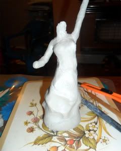
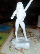
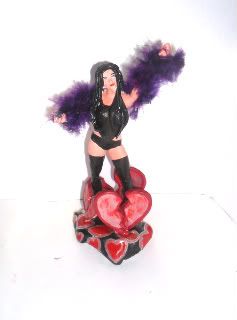
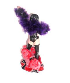
To create this one we took a classical approach by trying to vision the figure within the block of clay, you then start to cut out the shape you see and start to mould with your fingers as you go. This also gives a much more solid base to the figure as the torso and base are one.

Creating a female figure I found far easier than a male, the curves kinda suggest themselves and it is far easier to correct width than a more angular muscle based masculine form.
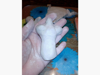
After kneading for a good hour I was ready to put knife to clay and decided to just go for it. I got the basic female shape which oddly resembled the statue of Liberty, in my head I knew what I was after. To my amazement the arm stayed in place in an upright position rather than flopping down.


This was due to using the clay correctly and all the kneading with the compounds and nylon gives it extra strength.
After the basic shape I kept the remaining clay wrapped in cellophane and then a damp cloth this stops it form drying out whilst letting the sculpted material dry out.
Then a basic head shape was placed and smoothed onto the neck using very little water, damp fingers… legs and feet only suggested as the stay within the main block.


After watching workshop clips which left me somewhat … WOW!  And a little hesitant to share what I was doing, it was pointed out to me to take things very laterally, don’t look at faces as features look at them as lines and shapes, break it all down, same with forming body parts.
The classic female in comics has very little detail, some hardly have a nose, and the most enhanced feature seems to be the eyelashes which are the indication that it is female.  Thighs take the general () shape, so by using some basic symbols:   -,  \, /,  _,  O,  ^,  ~, .,  along a horizontal or vertical line a human shape can be formed.

So with step by step instruction via the wonder that is Skype! I went in for the kill with trying to get the face better than 711!!
Using my pointy metal tool only a horizontal line was created to indicate a brow, ^ for the nose a smaller horizontal line for the mouth and two slightly larger pin point indentations for eyes… that was it!!
Next was the hands, form a basic shape and used scissors to create a finger and the rest is suggestion with lines. Again to my amazement the finger didn’t drop off…
For sculpting the hair I used epoxy, as this is what I am now used to and like it’s slight adhesive quality.

Another valuable lesson I learnt was not to be too gentle with it, put some strength behind it as it won’t fall to bits.
I feel it is time to throw away my nail files for filing and starting using what the big boys use and have a play with different grains of sand paper as there is no way I can get this stuff smooth by using an emery board.
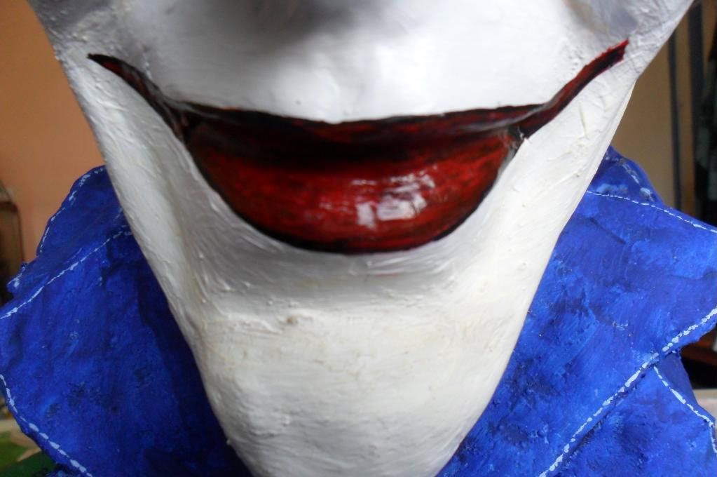
Otherwise everything else is painted on. Facial features again.. the bain of my life!! She doesn’t quite look irresisatble she has a kinda £10 Blackpool strip club look to her.
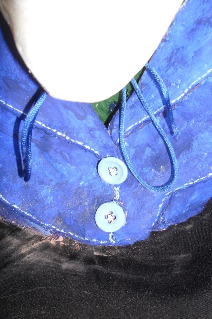
I wanted to add a burlesque feel so added texture with making her a feather boa and the base of standing on hearts whilst breaking out of them… Yeah! Symbolism baby!!


SO… Who is she??


This is the classic character known to Europe as CHICA BOOM BOOM!! And across the pond I believe she is known by CLARA DE NOCHE.
Originally appearing in the euro erotica books drawn by the superb JORDI BERNET. And then a somewhat tamed version in a Parisian newspaper strip.
I love the tongue and cheek strip, even though the backstory is the same, Chica is loved by ALL men, no man can resist her feminine charms and she exploits that to its full capacity, there is nothing she won’t do for money to make sure her son gets what he wants. She travels across the world breaking hearts….
So, my 2nd attempt at sculpting... if you view it from afar with a squint! It Looks OK…
I have learnt an awful lot in the two weeks I have been doing this and the most important lesson I have learnt is to be patient… rather than trying to do a full figure I am going to practice just heads and then move on to another part.

Getting the basics down… then I can move on to create something of worth.
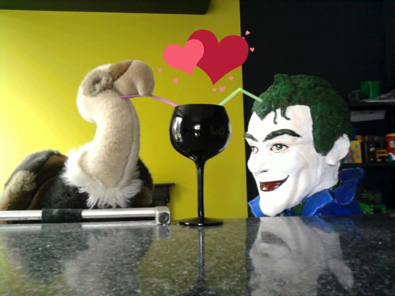
So to all my geeky comic book, sci-fi, arty friends… HAPPY VALENTINES DAY!! May Chica break your heart? ;)

Sunday, 6 February 2011

A Geek Girls Attempt At Sculpting...

After finding the allure of Go Hero products and being given some new clay to try out I decided come rain or shine to try and create a little man from scratch.

I shall warn you now before you go any further, the end result is not for the faint of heart… but it could have gone tits up a whole lot more than it did.
Whatever the result was, I was going to document it.
I used nylon enforced clay with silicon. I must say it was a little strange to use, this stuff was hairy inside so made any kinda cutting hard as the fibres would stick to the blade.
 It was fairly pliable but I made many mistakes.  I was using it as I would Fimo and flying blind on how and where the best place was to start.
I had no special sculpting equipment so used my fingers, water, a cotton bud and a rubber tipped pastel pushing art tool.

Thinking of how plastic figures are put together I took each limb separately then attached by gluing…  not a good idea as the glue, even super glue does not stick!
 So using epoxy  to bond the pieces together which added extra length to each limb giving the appearance of swollen thighs and shoulders.
Muscles sure do take strange shapes...especially if you Google ‘human male muscle anatomy’ but mostly, if not all were not natural and bordering on the gross.
 A normally shaped male muscle formation is harder to find than one would think, so did it from my head instead. 2nd mistake…
I was using plenty of water to smooth the clay which in hindsight would have been better if it had just been sanded as too much water made the clay crack which weakened the whole thing to the point of toppling.
 Again… epoxy was used as a filler then filed down.

First step :  I decided to see if I could get a basic torso shape. I was channelling the idea of the DC Universe body, the way the shoulders round and the basic ^ shape for the neck.

I wanted to create something with movement.  I was hoping I could do this via creating texture within his clothes but at this stage of the game I am ahead of myself in ability.
The shoulders I tried to place one leaning back and the other slightly forward as in this guy’s comic appearances he spends the majority of it fighting.
Meh… it looked OK, so what next?


 I needed something to support it and build around.
Next were the base and two legs. You can see the slight cracking on the thighs which is what I was meaning by using too much water. Luckily it flaked off and could be smoothed.


Attaching the torso was the epoxy way again…which was OK as it was hidden by his jacket so there is not really any groin he just has a hollowed out shape then filled with the epoxy to push the torso into place. Keeping the legs spread slightly  would balance out the weight more effectively.


 I then left it 24 hours to fully harden.


The following night was the addition of the arms, making any kinda detail to resemble fingers was tough going as I found the clay could be washed away or the opposite and looked like big fat sausages, so just left them as a basic indication of a hand shape.


Attached to the torso in the same way as the legs.


This guy sports a HUGE trilby, I really enjoyed making the hat but to go with an oversized hat, you get an oversized head…
 I hollowed out a small amount of clay so it could be placed onto the neck and filled and secured with the epoxy, rather than stuck on at an angle. I’m happy with that.
At this point though, this little man had more cracks than 18th century China…  fairly superficial cracks but still the potential  to become something more.


I reached for the ‘no more nails’ glue I had been sticking up the towel rail with earlier that night and filled them with that, then rubbed epoxy into them…. Ick… this was messy BUT it held together.


The need to disguise the cracks was fairly strong so decided to primer him and give his first coat. After it dried the details were added and the cape.


With the angle and bend in the back leg and foot withthe weight of the cape made the whole thing topple.
 So more support on the base was added with the creation of standing on rocks, it was easier to give support to the back leg this way.

So the final step of giving him the last coat of paint… so who is this guy?
This little man is called 711 he appeared in the first Police Comics alongside Plastic Man, Firebrand and the bad ass Mouthpiece. 711 got his name as this was his prison number from which he had escaped.
In true Golden Age style, they can’t keep it straight if his outfit is all shades of red or his cape is green. I chose the green as I thought it made him slightly more interesting.
What makes this guy important?

 He is the first character to ever be killed within comics something which these days means nothing as we know they will be back, but as far as I am aware 711 has not made a comeback, not even as a lantern of somekind or zombie!!! ;p


I have enjoyed the whole sculpting experience and I haven’t been put off by it.

I want to try again and not make the mistakes I did and already know who and what I want to attempt.
 It has made me far more aware and appreciative of the work and skill that goes into making figures.
 As a geek within an online geek community I think we can be all be too quick to call the shit out figures if they are not 100% comic accurate to how we visualise them.
 I am not talking about costume designs as that should be correct but we all perceive them slightly different and sometimes I think we should give these artists a break from our nerdom…
Granted I have hit 711 with the ugly stick but that is lack of ability, not that I wanted to.
Creating facial features I found the most complicated thing of all and will no longer look at ANY pre bought little man in the same way ever again!
So 711 stands his whole 9" on my desk next to my computer alongside of my very first paint job Spellbinder.
 For a first, I do feel it could have been a lot worse, but bring on the next one… let’s get some improvement going on this…